Saturday, June 26, 2010

Scanography with Borders

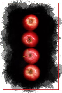
1. Apple 8 x 10 to Print
 
2. Apple 4 x 6 to Print

For this effect I was able to use the Flexible Brushed-on Effect. I started with my apple scanned image, added a new layer, then added a black mask to the apple image. I was then able to use the Heavy Brushes at various opacities to get the effect that you can see. I then selected the area for a border using the rectangular marquee tool, went to edit-stroke and added a heavy stroke that matched the color that I selected from the apples. Overall, I thought that this ended looking pretty good!

Scanography

One Scan:


1. Red Apples: June 23rd, 2010; 10:00 p.m.; Rexburg, ID; Epson Scanner
2. Scattered Pencils: June 24th, 2010; 9:40 p.m.; Rexburg, ID; Epson Scanner
3. Necklace: June 24th, 2010; 9:20 p.m.; Rexburg, ID; Epson Scanner
4. Old Glass Bottles: June 24th, 2010; 9:00 p.m.; Rexburg, ID; Epson Scanner
5. Lined Pencils: June 24th, 2010; 8:48; Rexburg, ID; Epson Scanner
6. Believe Block: June 24th, 2010; 9:10; Rexburg, ID; Epson Scanner
7.Bananas: June 24th, 2010; 9:22 p.m.; Rexburg, ID; Epson Scanner

Taking a scanography photo is really quite simple once you get the hang of it. One thing that I found is that the room must be dark in order to get that beautiful black in the background. This also allows for more detail in the foreground and depth if you put something on your scanner that has more dimension. I had a hard time with flowers and greenery, but decided to just use things that were lying around my apartment instead. I think that some of them turned out really well. I am excited to see what else I can do. So, what I did was place something on my screen, leaving the screen panel up (this gives you the black) and turning off all the lights in the room. I then used the Epson settings to increase the contrast a little and make sure the exposure was correct. After that all you have to do is push scan!

 Three Scan Collage:


1. Pennies: June 24th, 2010; 6:57 p.m.; Rexburg, ID; Epson Scanner
2. Believe: June 24th, 2010; 8:48 p.m.; Rexburg, ID; Epson Scanner
3. Orange Ribbon; June 24th, 2010; 6:39 p.m.; Rexburg, ID; Epson Scanner
4. Edited Scan Collage; June 25th, 2010; Rexburg, ID

After I was able to get three shots that I really liked from the scanner then I was able to open them in Photoshop and put them together. I first used the move tool to bring all three photos onto the same document. Then, I overlayed them together and masked out different portions so that I could get the desired effect. In the end I really put together three different photos that really don't go together at all, however, I think that it worked out pretty well.

Tuesday, June 22, 2010

Fine Art Template


1. Fake Flower: Monday, June 21st, 2010; Madison, WI; 3:34 p.m.; f/2.7; 1/30 sec; SONY DSC-H50
2. Tulip Fine Art Template: June 21st, 2010; Madison, WI West Valley Mall
3. Pearls and More; June 21st, 2010l Madison, WI; 3:55 p.m.; f/ 2.7; 1/20 sec.; SONY DSC-H50
4. Pearls Fine Art Template; June 21st, 2010; Madison, WI West Valley Mall

This was a really fun assignment. I really enjoyed learning how to make a template and then use it to really enhance my photos. I think that I am going to use this template more for my website. I was able to use the clipping mask and layers to make a template in Photoshop, and then I was able to add my photo (wonderful clipping mask useage) and with no other edits just place the photo where I wanted it to go.


Photolusion

Straight, No edits:

Edited Photolusion Photo:


1. Spewing Water: Monday, June 21st, 2010; 5:58 p.m.; Dodgeville, WI; f/2.7; 1/20 sec; SONY DSC H50
2. Huggin' a Couch: Monday June 21st, 2010; 6:02 p.m.; Dodgville, WI; Edited Photo: Blended together three photos, selecting the hands and putting them into the basic photo.
3. Left Arm; Monday June 21st, 2010; 6:01 p.m.; Dodgeville, WI; f/2.7; 1/4 sec.; SONY DSC-H50
4.Head; Monday June 21st, 2010; 6:02 p.m.; Dodgeville, WI; f/2.7; 1/4 sec.; SONY DSC-H50
5.Right Arm; Monday June 21st, 2010; 6:04 p.m.; Dodgeville, WI; f/2.7; 1/4 sec.; SONY DSC-H50

This was really hard for me to try to be creative. I was in Wisconsin for the weekend with my husband and so he helped me a little bit with this project. We were planning on a really creative plan, however, there was a tornado and we couldn't leave our hotel room, so we had to improvise. We shot the water from the shower and he stood in front of it, which made it look like he was spitting water out his mouth unusually. Then, the second photo was taken in the lobby of the hotel. I had to take it in three shots, and then blended them together with different selections and other edits. It ended up being a pretty cool look I thought.

Monday, June 14, 2010

Night and Light


1. Horizontal Lights: June 14th, 2010; 10:43 p.m.; Rexburg, ID f/5.6; 3 sec.; SONY DSC H50; Enhancements in Camera Raw
2. Bright Color; June 14th, 2010, 10:40 p.m.; Rexburg, ID f/3.5; 3 sec.; SONY DSC H50; Enhancements in Camera Raw
3. Stars: June 14th, 2010; 10:05 p.m.; Rexburg, ID; f/2.7; 5 sec.; SONY DSC H50: Enhancements done in Camera Raw
4. Covered in Light: June 14th, 2010 10:37 p.m.; Rexburg, ID f/4.0; 8 sec.; SONY DSC H50; Basic enhancements done in camera raw
5. Covered in Light with Burned Border; Rexburg, ID; I really loved adding this border because it really helped the light just pop off the picture.
6. Family with Flash Light; June 14th, 2010; Rexburg, ID; f/ 2.7; 8 sec; SONY DSC H50; Blacks enhanced in Camera Raw.

The first two photos are Camera Motion Painting Technique. I put down some christmas lights and then moved the camera to make the motion of the light go horizontally.  The other four I think were considered Light Painting. I used a tripod and increased the shutter speed to be able to get the light movement that I wanted. For these ones I used a flash light to focus light on the stars and on the family sign. It allowed for a focal point or point of interest in image. The other photo was me moving the christmas lights in the middle of the room. The lights turned out much brighter than I expected. I think this was because there was so many of them shining so bright.


Edge Effects


1. Green Buoy: June 11th, 2010; 11:15 a.m.; Tacoma, Washington; f/3.5; 1/400 sec.; Cannon Powershot S3IS, Enhancements done in camera raw.
2. Green Buoy with a Border: June 11th, 2010; Tacoma, Washington: Tacoma Waterfront Walk, Glass Art Museum and Chihuly Bridge
3. Farm Boots: June 11th, 2010; 3:30 p.m.; Puyallup, Washington; f/2.7; 1/60 sec.; Cannon Powershot, S3 IS, Enhancements done in camera raw.
4. Farm Boots with Burned Border: June 11th, 2010; Puyallup, Washington Farm Home (my in-laws house)
5. Glass Ceiling: June 11th, 2010; 10:49 a.m.; Tacoma, Washington; f/2.7; 1/200 sec.; Cannon Powershot S3IS, Enhancements done in camera raw.
6. Glass Ceiling Postcard; June 11th, 2010; Tacoma, Washington Chihuly Bridge Ceiling; the bridge has glass art everywhere, including the ceiling!

For the first photo I took by the Tacoma waterfront pathway. I loved the green of this buoy that just stuck out at us because of the bright color. I decided to use that green color and create a a variation on the Flexible Vignette (tutorial #14). I added a new blank layer, making it black, using the marquee tool to draw a box inside the edge of the image. I then, added a stroke to the selection and used the green color of the buoy to make it pop. The second border technique was a Burned Border, copying the background layer, using the multiply blending mode and then using the marquee tool to select the middle of the image and delete the middle of the selection. The last border technique I used was the Flexible Brushed-on Effect where I added a new layer, with a black layer mask on the image that was on the top layer. I then used the bush tool with the thick, heavy brushes to get the desired effect, changing the opacity and brush size. I then added a stronger black border with text describing the place.


Monday, June 7, 2010

Editing Project 365

 
1. Original Template; Designed June 7th, 2010
2. Weekly Template filled: June 1st-7th, 2010

I started with one of the templates that we were given and then suddenly I had erased almost everything that was put on there and how the layout was. I decided to go with something a little bit more elegant and yet simple. I like flowy lines with big strokes. I added a few different strokes behind all of the photos and then changed the text to match, with a strong simple arial for the dates so that it showed a little contrast and was very readable. I then took each individual photo and used the move tool to move them onto the layout image. I then moved the image on top of the white box layer that it was going to move into. I then selected the layer with the image and then right clicked that layer and selected the clipping mask option. It automatically was masked onto the layer underneath it, which put it into the white box selected for it to belong to. I was then able to size the image and move it around within the box to where I wanted it for this project. Doing this makes it easy to exchange different images and re-use or re-design the template over and over again!